Exploring College Football Data using Shiny
Introduction (aka “O autumn thunder, why do you hurt me so?”)
One of the most unhealthy relationships I have is my seasonal affair I have with college football. I was never much of a big sports fan as a kid, but when I when to college at Rutgers, I got a real taste of what it’s like to be part of a tortured but dogged fanbase. I’ll never forget beating Michigan on a blocked field goal in 2014 (Yeah! We beat Michigan once!) or getting absolutely poured on during blowout Homecoming loss against Wisconsin in an empty student section. The annual fall torment of Rutgers football was then compounded when I moved to OSU and got to watch the Beavers lose game after game (although I did get to rush the field when we beat the Sun Devils in 2018). While nothing fills me with self-inflicted misery like turning on ESPN on October weekends, the quarantine has made me really pine for that autumn thunder.
Unlike professional sports, college football is the one major American sport that relies predominantly on recruiting young high school athletes. No matter how much of a star a college athlete is, they have a contract with a hard end date. At most, you can stay in college for six or so years and play for your team (lookin’ at ya, JT Barrett). Therefore, recruiters are constantly trying to find promising high school talent to fill the ranks of departing upperclassmen.
Recruiting is a really complex art and the success of a recruiting department depends on many factors. The interpersonal skills of the coaching staff is but one small piece of the puzzle! Booster money, university administration support, the local high school football scene, the football culture of the university, and recent success all have some influence on recruiting perception of each school.
I thought it might be interesting to see how the number of wins (often used as a proxy for the general quality of the on-field product) relates to the recruiting efforts for different teams. An exploratory tool would be ideal for this, since different teams would be likely be impacted differently. After all, blue-blood schools like Ohio State and Alabama have a powerful brand that give them an edge over many other universities, even in their down years. My tool of choice for something like this would be Shiny, an R tool for creating interactive web apps and dashboards.
Building the App
We’ll need to install a couple packages to create this app. I used the following packages:
library(shiny)
library(tidyverse)
library(ggrepel)
library(shinyjs)
library(plotly)
I used tidyverse to clean the data which I pulled from a great API (check it out here).
Not shown here is the packages jsonlite which I what I used to actually get the data from both the coaches and teams/talent endpoints.
We will use shinyjs and plotly to add additionaly interactivity to the app.A
A brief primer on Shiny (it’s pretty straightforward!):
- A Shiny app is contained in a single R script, usually called
app.R. This script has to contain two functions:- A
serverfunction which performs computation, data manipulation, etc. - A
uifunction which defines how the app looks, all the available widgets for the user to interact with, and when certain panels are visible.
- A
- At the end of the
app.Rfile, these functions are called inside of ashinyAppfunction, usually looking something likeshinyApp(ui = ui, server = server).
App Goals
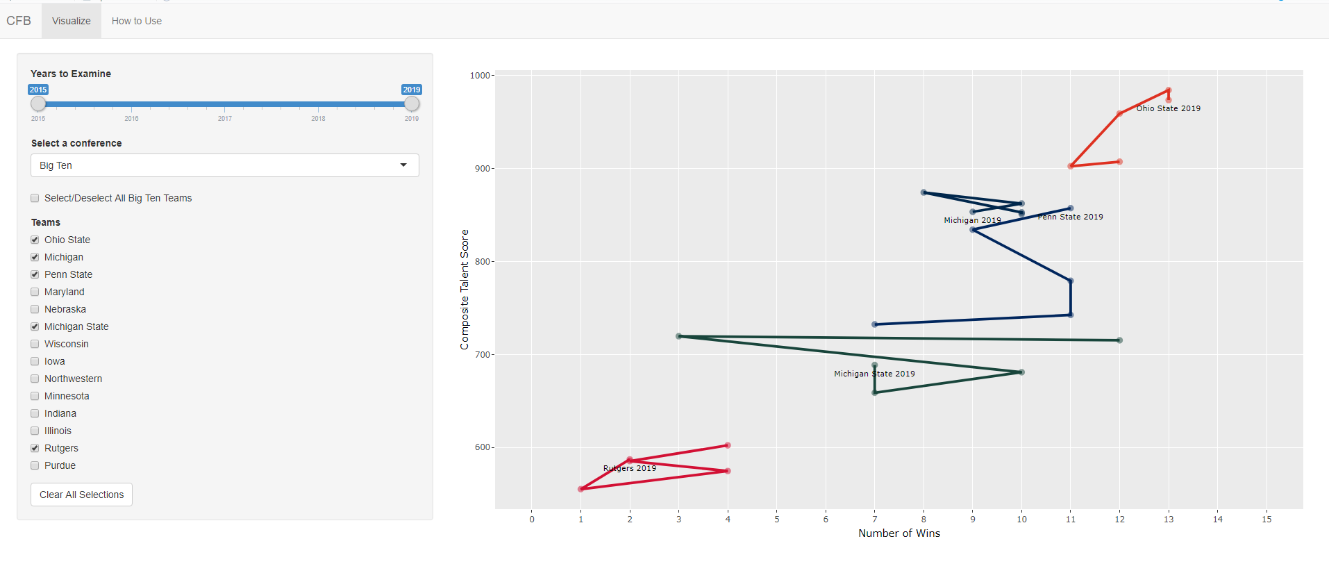
I want to basically see how the number of wins influences different teams ability to recruit. The strength of recruitment is measured by the website 247sports using a statistic called Talent Composite.
The API I utilized had the talent composite for teams in the previous 5 years, so I could plot how a team did in recruiting over time. I also wanted users to be able to compare different teams side by side, so there should be functionality to select multiple teams from different conferences.
For the purposes of this app, I just wanted to focus on Football Bowl Subdivision (FBS) teams which represent the highest division of DI college football.
The User Interface
I wanted my UI to have several conditional panels which had checkboxes where the user could display their teams of interest.
Since FBS has over 132 teams, it probably wasn’t a good idea to have a checkbox with all the teams displayed at once. It makes sense to instead have a dropdown menu of conferences (there are 10 conferences in FBS, plus independents) to filter the selections and then just display teams in those conferences. Most users will probably be interested in comparing teams from the same conference, so this UI design choice makes sense from their perspective.
In the end, my UI looked something like this.
Here is the first chunk of code in my ui function:
ui <- navbarPage(

  "CFB",

  tabPanel("Visualize",

    sidebarPanel(

      sliderInput("range", "Years to Examine", min = 2015, max = 2019, step = 1, value = c(2015, 2019), sep = ""),
      selectInput(inputId = "conference", label = "Select a conference",
                  choices = unique(wintalentdata$Conference)[order(unique(wintalentdata$Conference))]
                  ),
      conditionalPanel(
        condition = "input.conference == 'Big Ten'",
        checkboxInput("allb10", "Select/Deselect All Big Ten Teams", value = FALSE),
        checkboxGroupInput(inputId = "b10_teams", label = "Teams",
                           choices = b10_teams,
                           selected = c()
      )
),
      conditionalPanel(
        condition = "input.conference == 'SEC'",
        checkboxInput("allsec", "Select/Deselect All SEC Teams", value = FALSE),
        checkboxGroupInput(inputId = "sec_teams", label = "Teams",
                           choices = sec_teams,
                           selected = c()
      )
),

....
There are a few things here:
- The interactive widgets include a
sliderInputto select different years - The
selectInputcreates dropdown menu to pick different conferences - The conference selection changes the conditional panel below it which shows different teams - there is a panel for Big Ten teams, a panel for SEC teams, etc. I left the 9 other groups off since it would take up too much space.
- Each conditional conference selection panel has checkboxes for teams as well as a single checkbox to select and deselct all teams in that conference
An additional button to clear all selection is also built in underneath all the selection panels.
We also define the mainPanel inside of the UI function which should display the output plot using the function plotlyOutput
This is where the plotly component is important, since plotly allows us to create helpful tooltips over parts of our plot and zoom in/out when the user needs.
......

),
	actionButton("clear", "Clear All Selections")
),
	mainPanel(
	  plotlyOutput(outputId = "plot", height = "700px")
	)
),
  tabPanel("How to Use",
           headerPanel(includeMarkdown("README.md")),

           mainPanel(
             img(src = "exampleplot.png", align = "center", height = "500px", width = "auto")
           )
  ),

  useShinyjs()

)
The call to useShinyjs() is important here since otherwise we cannot use the helpful reset function which we use to our clear user selections.
The server function
The server function is basically where we make all the interactive magic happen.
The serve function takes user selections as input$[INPUT] arguments, so that syntax will appear often in the server function.
We build the app behavior and plots inside of this function.
server <- function(input, output, session) {

  observe({
    updateCheckboxGroupInput(session,
                             'b10_teams',
                             choices = b10_teams,
                             selected = if(input$allb10) b10_teams)
  })

  observe({
    updateCheckboxGroupInput(session,
                             'sec_teams',
                             choices = sec_teams,
                             selected = if(input$allsec) sec_teams)
  })
The first part of the server needs to handle the event where users want to select all teams belonging to a particular conference. When a user selects this button, there needs to be an update to the checkbox inputs so that all the teams are automatically checked.
This can be done using the observe function to wrap the updateCheckboxGroupInput function.
There needs to be an observe call for every conditional panel, so since we have 11 panels, we need 11 calls to observe.
The next part of the serve function captures all the selected teams amongst all the conferences (since teams from different conferences can be checked at the same time).
This was done using a call to the reactive function.
The difference between reactive and observe is that reactive can return objects (like dataframes) that can be used elsewhere in the code.
There is another function called observeEvent which the documentation says monitors for specific events/changes in a single variable.
It probably could have been used above to monitor the checkbox input, which would possibly make for good performance improvements.
  selectedteams <- reactive({
    wintalentdata %>% filter(School %in% c(input$b10_teams,
                                           input$b12_teams,
                                           input$sec_teams,
                                           input$acc_teams,
                                           input$p12_teams,
                                           input$mid_teams,
                                           input$aac_teams,
                                           input$sun_teams,
                                           input$mw_teams,
                                           input$cusa_teams,
                                           input$ind_teams) &
                               Season %in% seq(input$range[1], input$range[2], by = 1))

  })
The Clear All Selections button was implemented using the shinyjs::reset function on every reactive element.
  observeEvent(input$clear, {
    reset("b10_teams")
    reset("allb10")
    reset("acc_teams")
    reset("allacc")
    reset("b12_teams")
    reset("allb12")
    reset("p12_teams")
    reset("allp12")
    reset("sec_teams")
    reset("allsec")
    reset("ind_teams")
    reset("allind")
    reset("aac_teams")
    reset("allaac")
    reset("mid_teams")
    reset("allmid")
    reset("sun_teams")
    reset("allsun")
    reset("mw_teams")
    reset("allmw")
    reset("cusa_teams")
    reset("allcusa")
  })
Finally, the actual plot generation is done using good old ggplot2 code.
We need to have a default empty plot to display if there are no teams selected, otherwise the app’s main panel will be completely empty.
The first if-statement captures that scenario.
If there are teams selected, then we create a plot using geom_path (which creates connected line segments for each team to show change over time).
Labels for each team’s line is inserted into the plot using geom_text, but only displayed for the point noting the most recent season selected.
This was a design choice to keep the plot from being too busy.
All calls from the plotly package: plotly::renderPlotly and plotly::ggplotly are needed to display the interactive hover tooltip as well as the zoom-in/zoom-out feature of the plot.
The tooltip by default takes whatever the text aesthetic mapping is, so we make use of the str_c function to concatenate relevant information in a single string: coach(es), season, talent score, etc.

  output$plot <- renderPlotly({

    if (nrow(selectedteams()) == 0) {

      p <- ggplot() +
      scale_x_continuous("Number of Wins",
                         limits = c(0, 15),
                         breaks = seq(0, 15, 1)) +
      scale_y_continuous("Composite Talent Score",
                         breaks = seq(0, 1000, 100)) +
      theme(
        legend.position = "none",
        panel.grid.minor.x = element_blank()
      )

      ggplotly(p)

    } else {

      p <- ggplot(selectedteams(), aes(text = str_c("Head Coach(es): ", coaches,
                                                    "<br>Season: ", Season))) +
      geom_point(mapping = aes(x = Wins, y = `Talent Rating`, color = School), alpha = .5, size = 2) +
      geom_path(mapping = aes(x = Wins, y = `Talent Rating`, color = School, group = School), size = 1.0) +
      geom_text(subset(selectedteams(), Season == input$range[2]),
                mapping = aes(x = Wins, y = `Talent Rating`-10, label = paste(School, Season)), size = 3) +
      scale_color_manual(
        values = as.character(unique(select(arrange(selectedteams(), School), c("School", "color")))$color)
      ) +
      scale_x_continuous("Number of Wins",
                         limits = c(0, 15),
                         breaks = seq(0, 15, 1)) +
      scale_y_continuous("Composite Talent Score",
                         breaks = seq(0, 1000, 100)) +
      theme(
        legend.position = "none",
        panel.grid.minor.x = element_blank()
      )

      ggplotly(p)

    }
  })
The only somewhat clever part of this plot in my opinion was getting the colors to match up to their respective teams.
By default, all scale color functions like scale_color_manual insert the colors in whatever order they are provided.
However, the geometries in ggplot are plotted in alphabetical order (i.e. Alabama comes before Auburn comes before LSU comes before Texas A&M, etc.)
We can enforce alphabetical order of the colors by sorting the colors by school first, removing duplicate rows, then feeding that into scale_color_manual.
Deploying the App
There are a couple ways to deploy a Shiny application, some of them being harder than others. The easiest way to host a Shiny app is to let RStudio’s shinyapps.io PaaS which handles the hosting for you. The documentation is very easy to follow once you get the app working locally, so it’s not really worth talking about.
This application is hosted here on shinyapps.
One thing that I want to figure out is hosting a shiny app on a VPS using Shiny Server. The main benefit of this as far as I’m concerned is getting a custom domain name instead of a shinyapps one. After a weekend of wrestling though on an Ubuntu 19.04 VPS, I’m actually stuck on even installing dependencies for base R on the most recent version of Ubuntu (other users have encountered this problem, as seen here.
I’ll have to try again on either Ubuntu 18.04 or 16.04. That’ll be good content for a future post!